 Alex Camp
PEAK6 / Poker Power
First-week retention, tripled.
I rebuilt the app's navigation and designed a guided first-game experience, so new members learn poker by playing a real hand instead of reading about it.
- RoleStaff Product Designer
- Timeframe2023 – 2025
- TeamSole designer across 3 pods
- PlatformMobile app
The complexity
A live table is intimidating.
Poker Power teaches women confidence, risk-taking and negotiation through poker. Most new members have never played.
The app mixed playing and learning in a way that confused them, and too few started, or finished, a first game.
- New membersMost have never played, and a live table is intimidating.
- InstructorsReal-time control of a live game while they teach, without hiding the table.
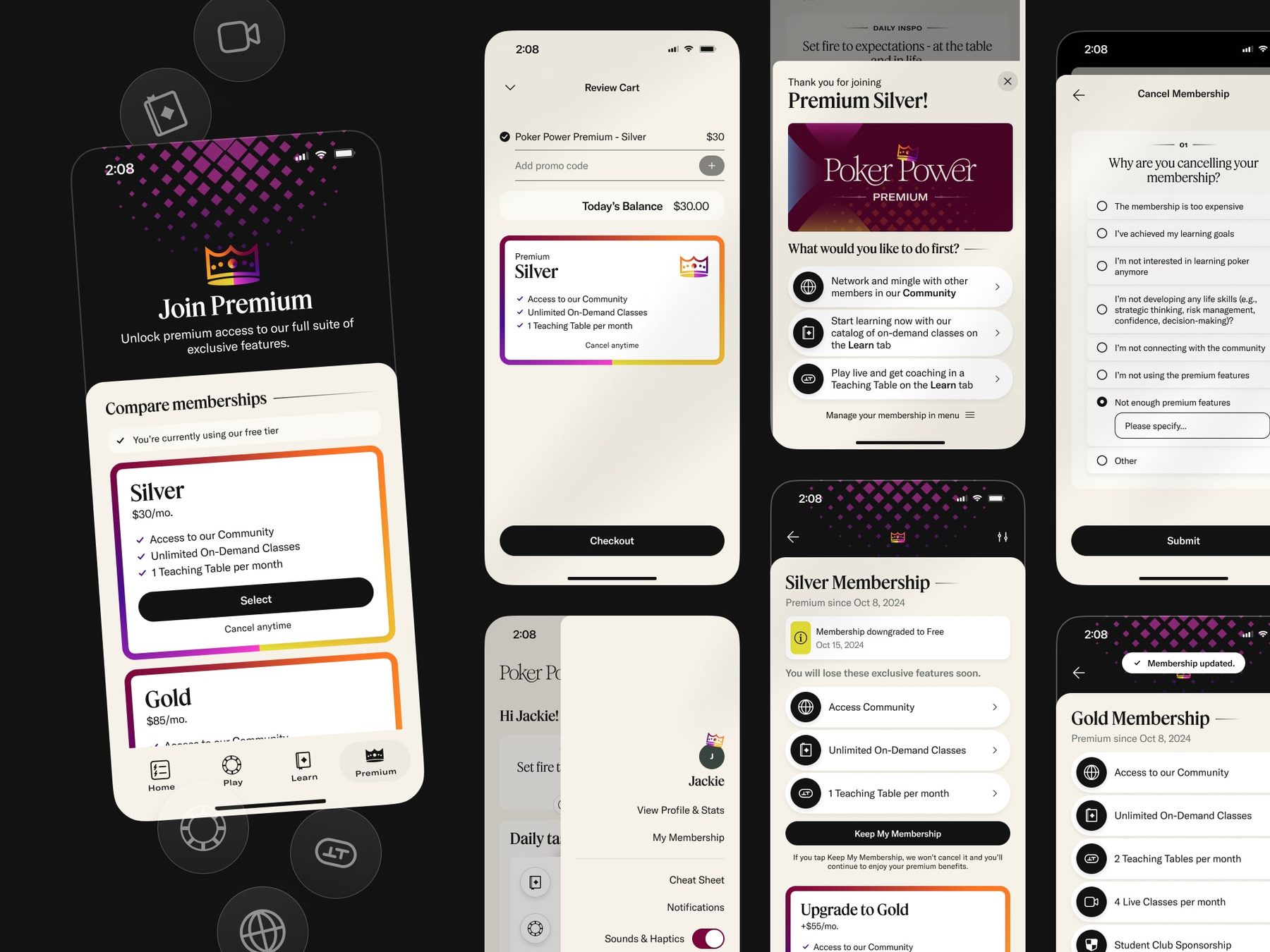
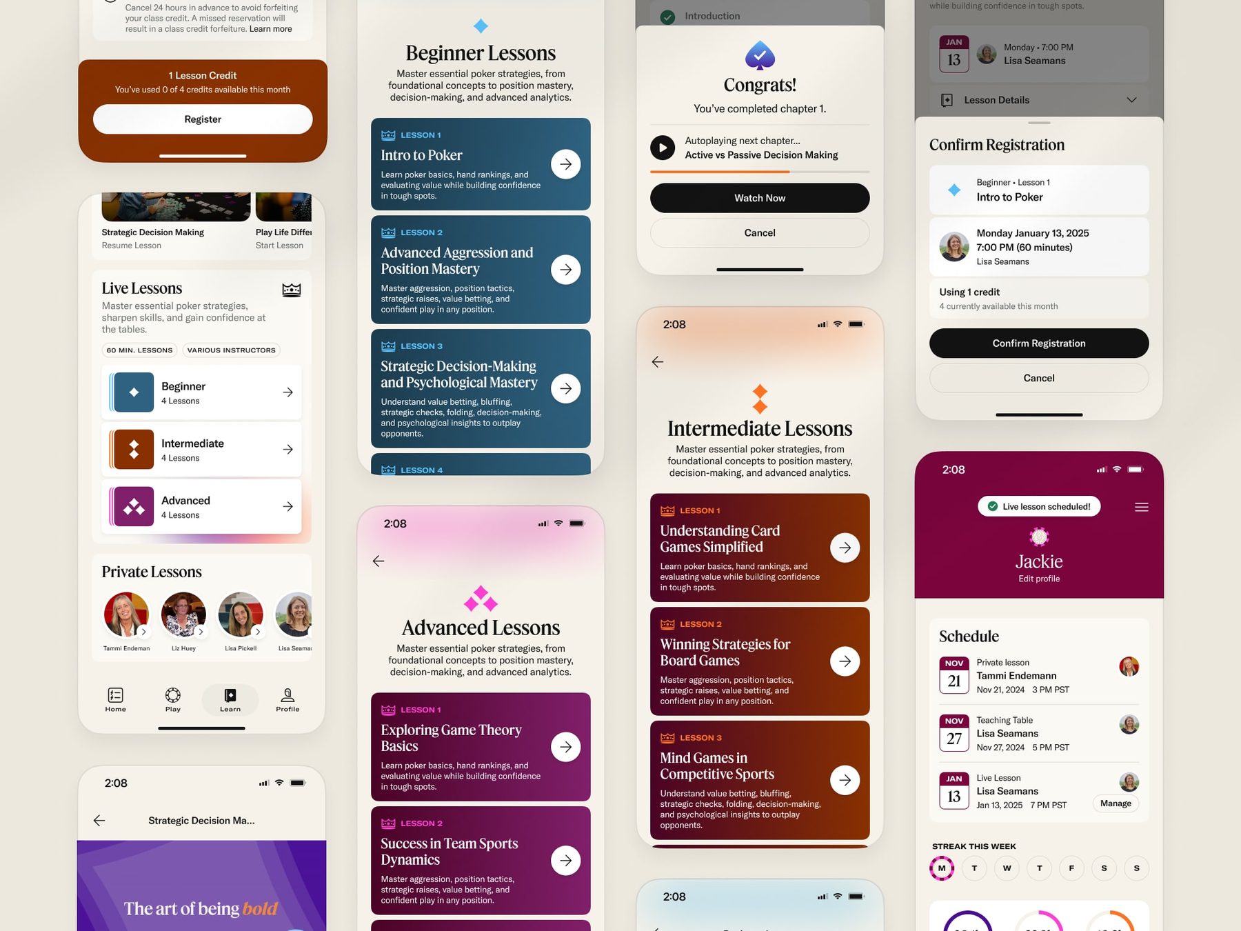
- BusinessA new membership launching at the same time: videos, lessons and daily tasks.
- TeamOne designer, me, across three product pods.
How I untangled it
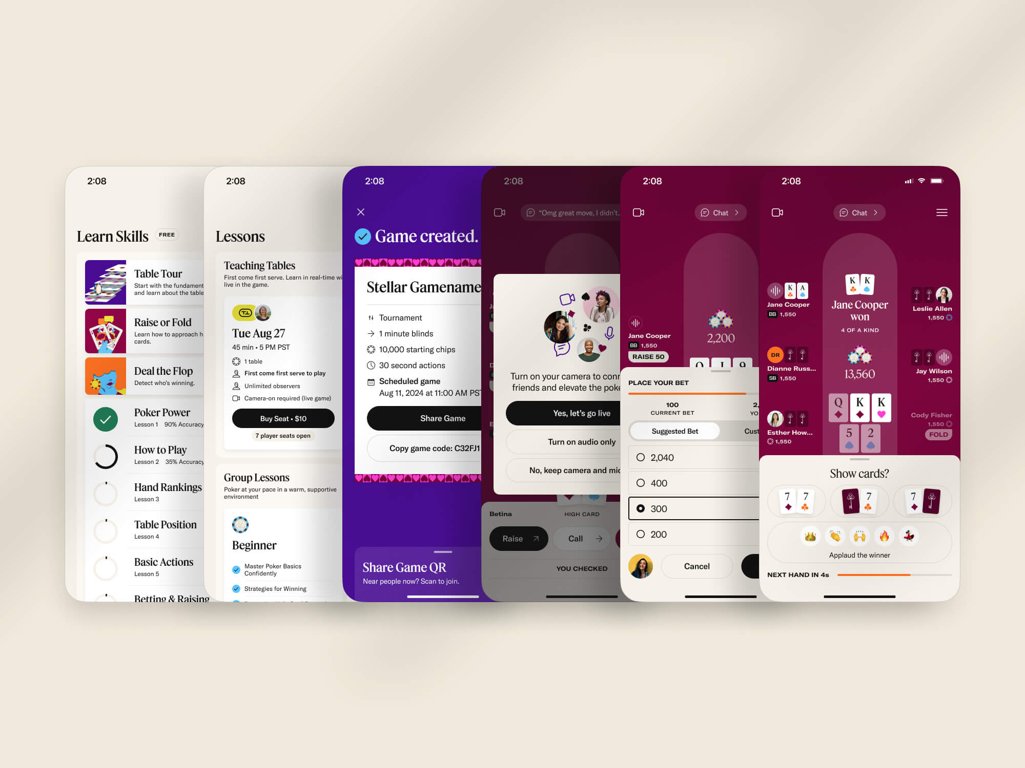
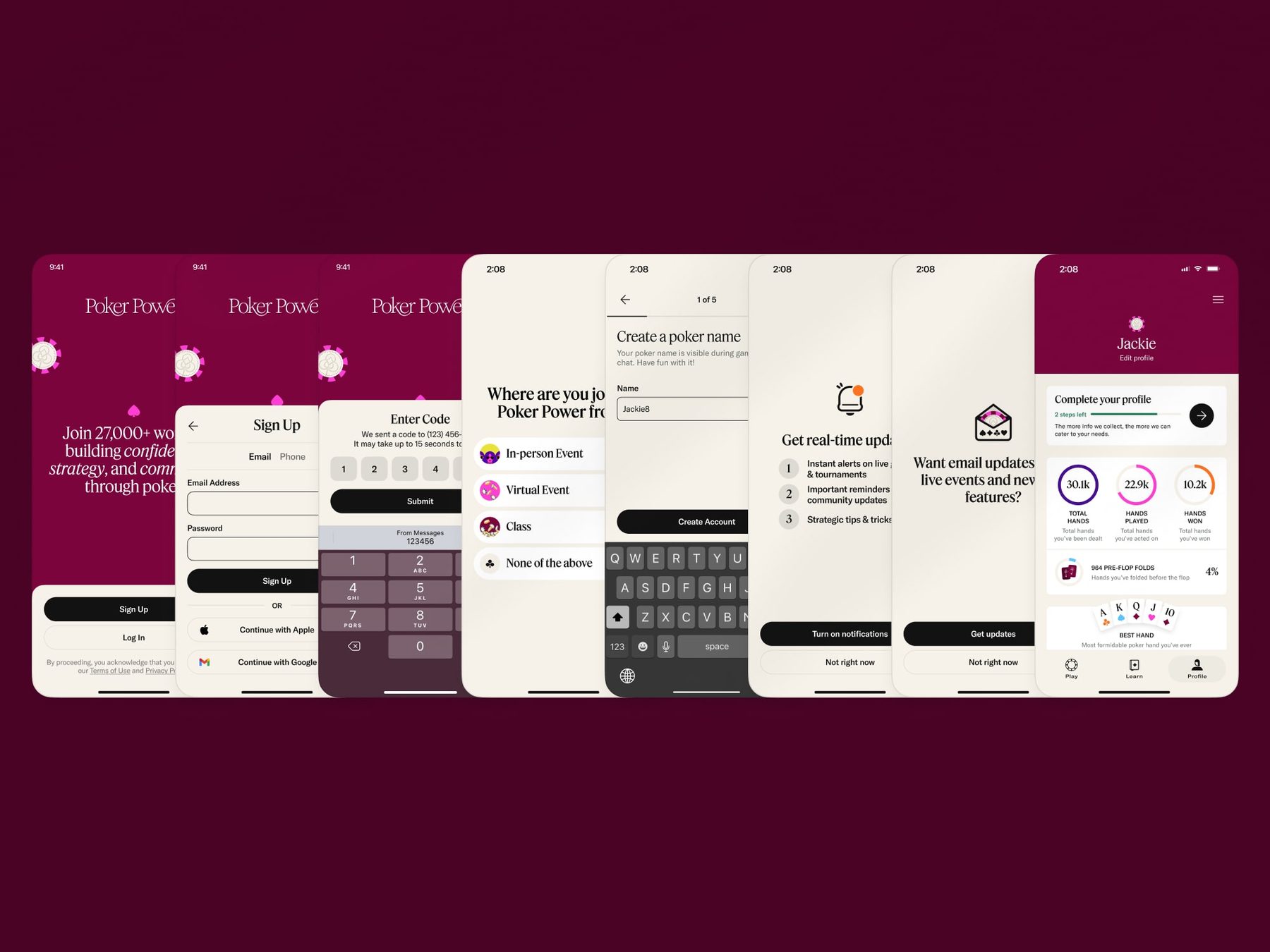
I built one reusable design system and brand identity that carried the same look, feel and UX across the existing app, the new membership features, the marketing website and even our live events. A shared set of design principles made three pods' work feel like one product, and gave every new feature a foundation to build on.
Key decisions
What I changed.
-
01
Separate Play from Learn
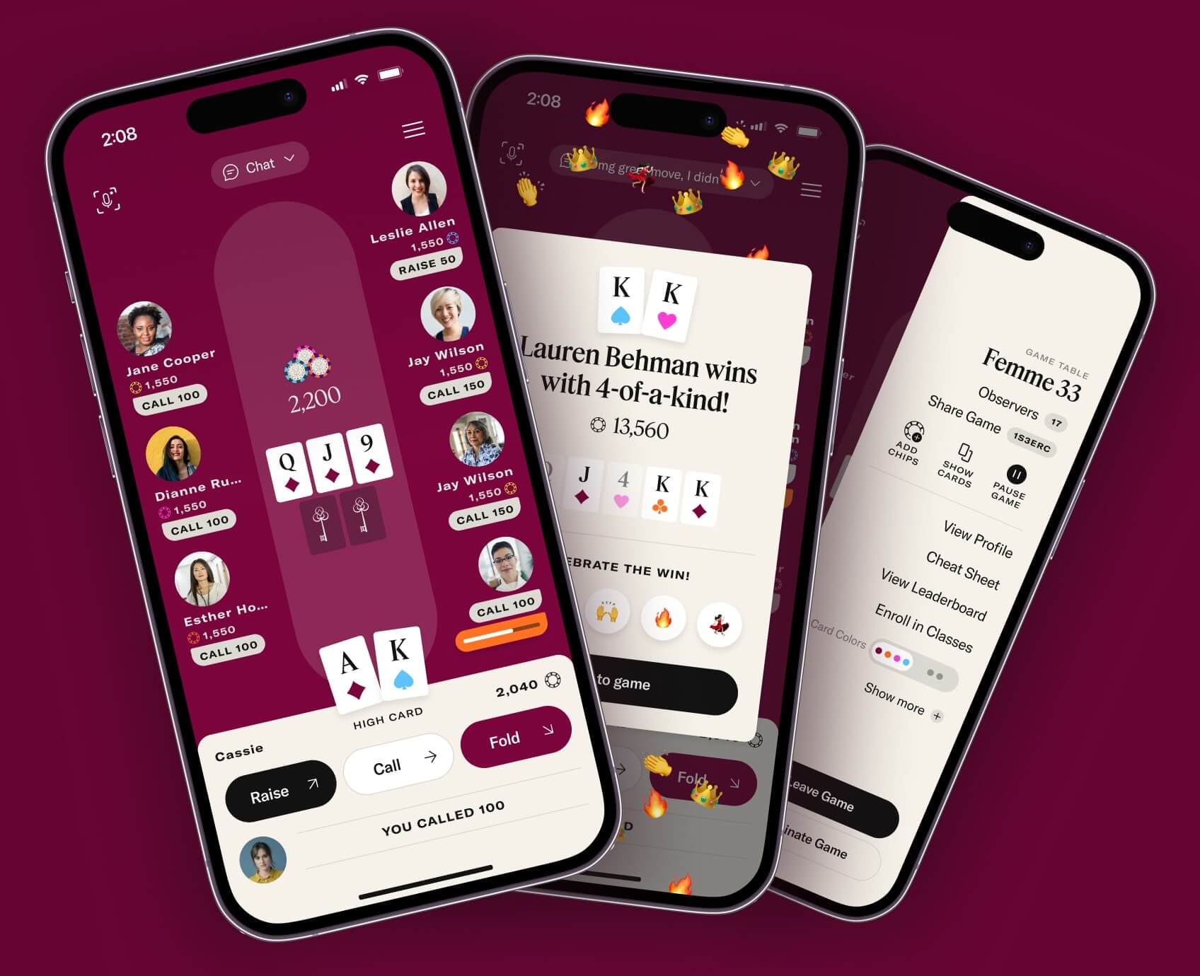
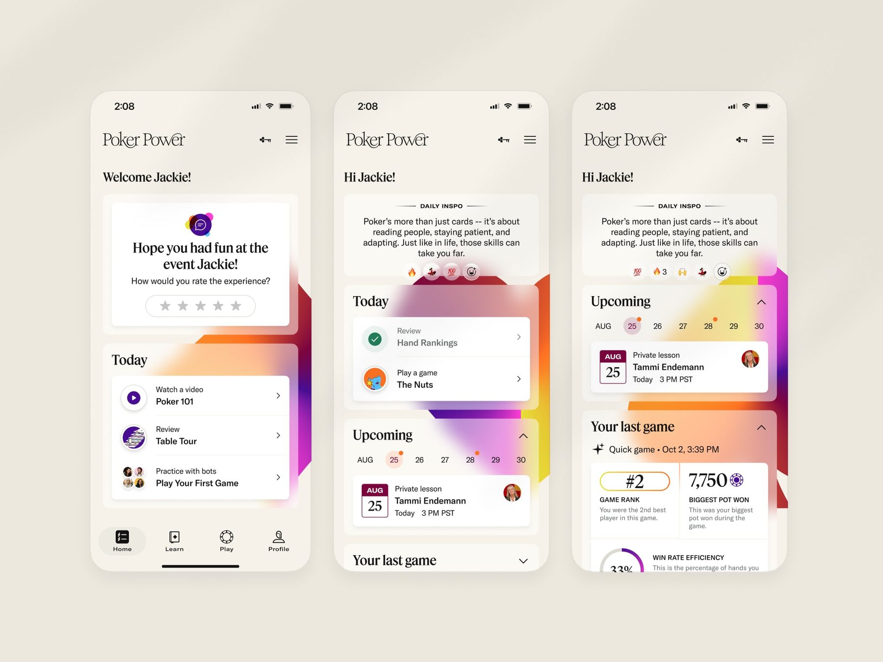
A global tab bar gave each mode its own home, so new members always knew where they were and what to do next.
-
02
Teach inside a real hand
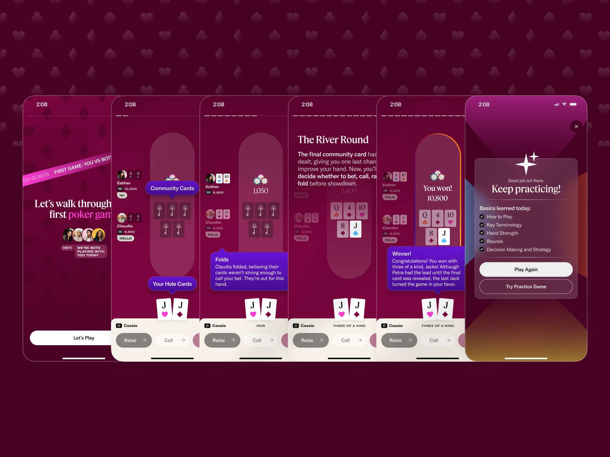
With my PM, I designed a choreographed, pop-up-video-style first game that walks players through a simulated match one rule at a time.
-
03
Bring them back on their terms
Players choose when to be nudged about community games, and the core table got more contrast and less friction.
The tradeoff
How to teach a first game.
Why
I didn't want story-style screens the whole way through, and some ideas need more room than a tooltip. So I blended two formats: larger explanations overlaid on part of the table, and bright tooltips that point at exactly what they're teaching. The result is a 17-step game that takes about three minutes.
The tradeoff: it took less engineering time, but moved work onto my PM, who mapped every hand with a poker instructor so each teaching moment landed in the right order without getting wordy. We got a repeatable experience we fully controlled, and new players got the feel of a live game. It drove +86% game starts and +82% first-game completion.
Also shipped
The work, up close.
Impact
What moved.
- 3×First-week retention
- +86%Game starts
- +82%First-game completion
- +23%Session time
Team results from product analytics. I owned the design of navigation, gameplay and the first game, partnering with product and engineering.
More from the project (08)
A few more screens.
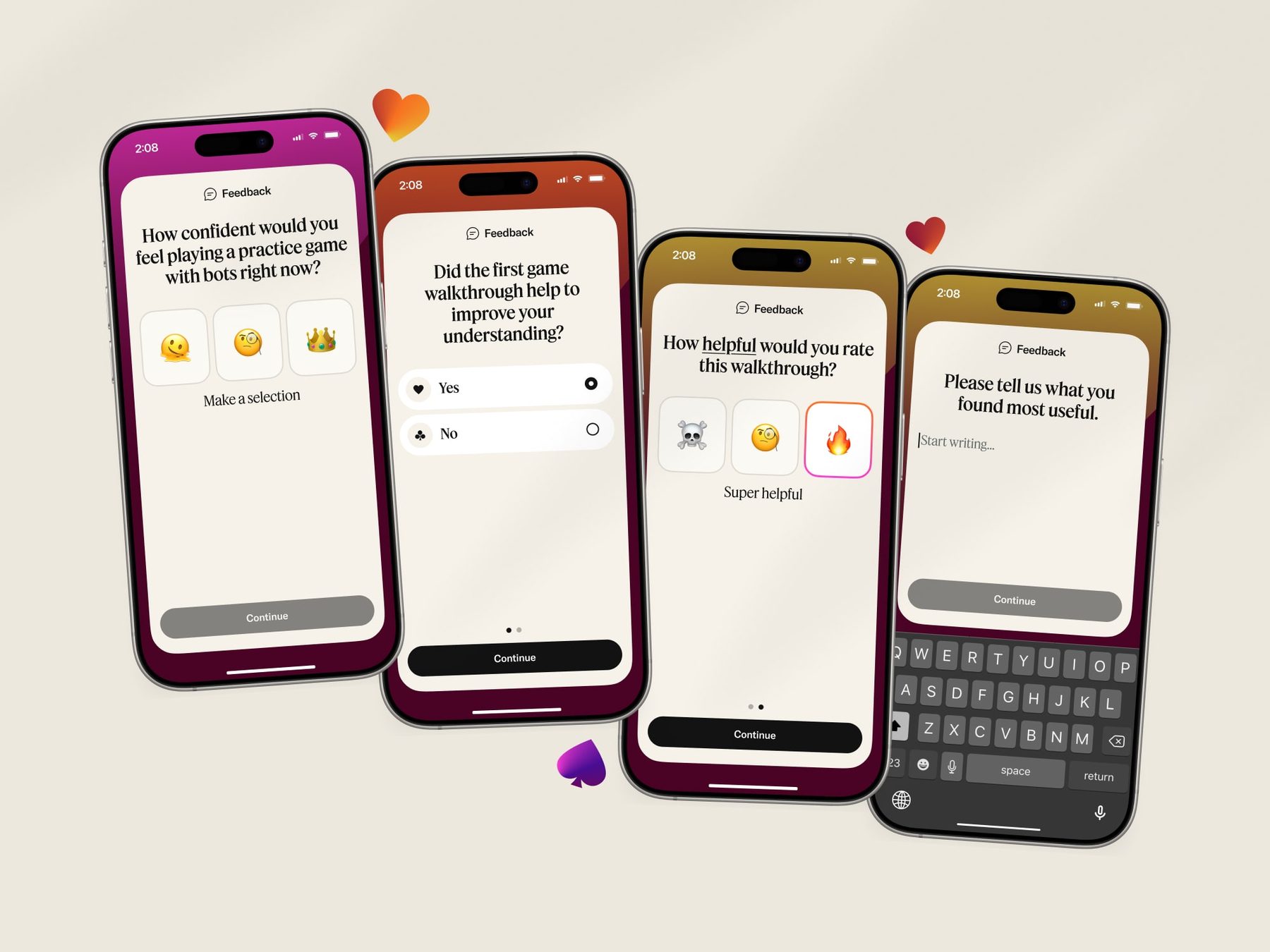
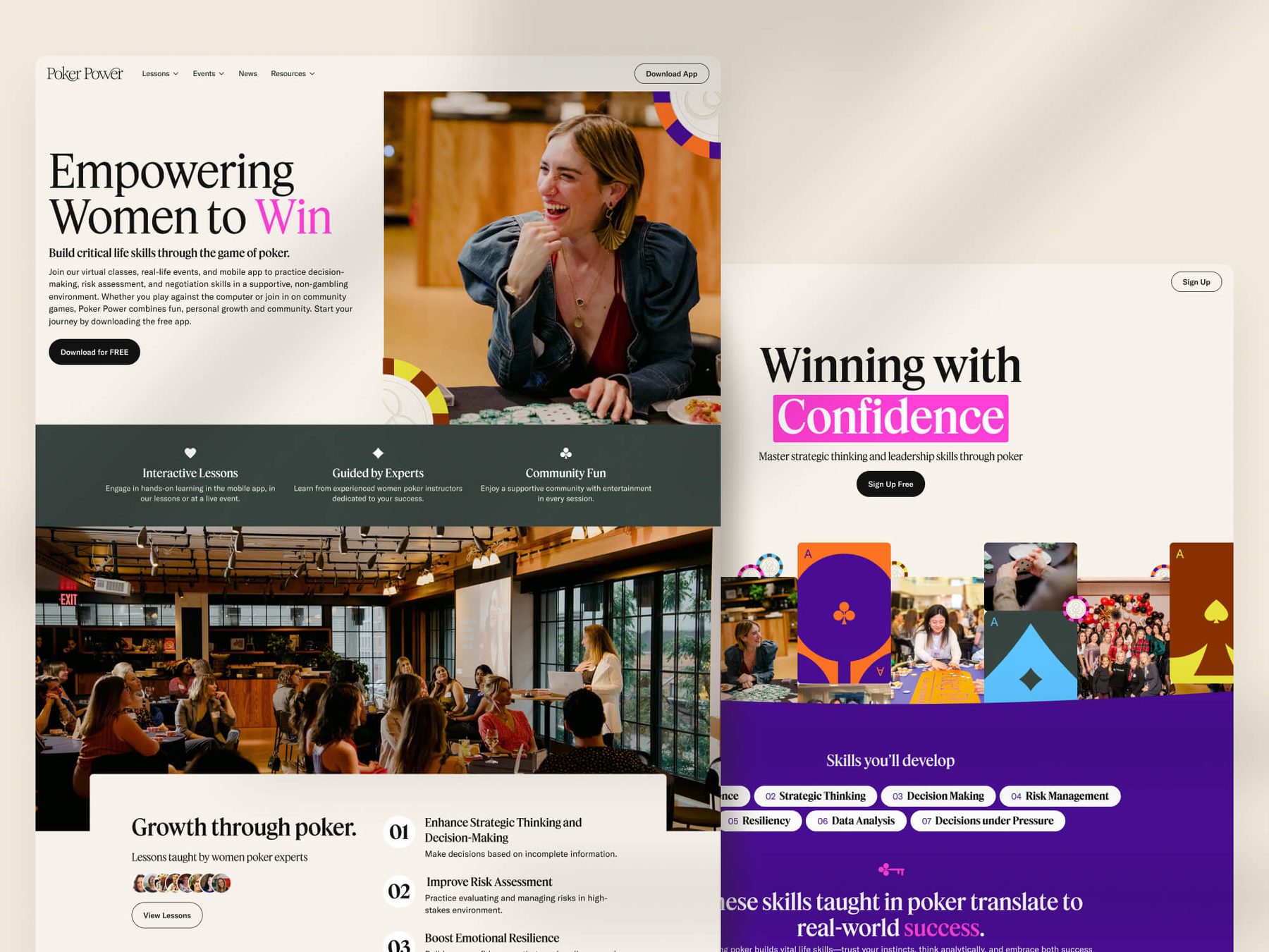
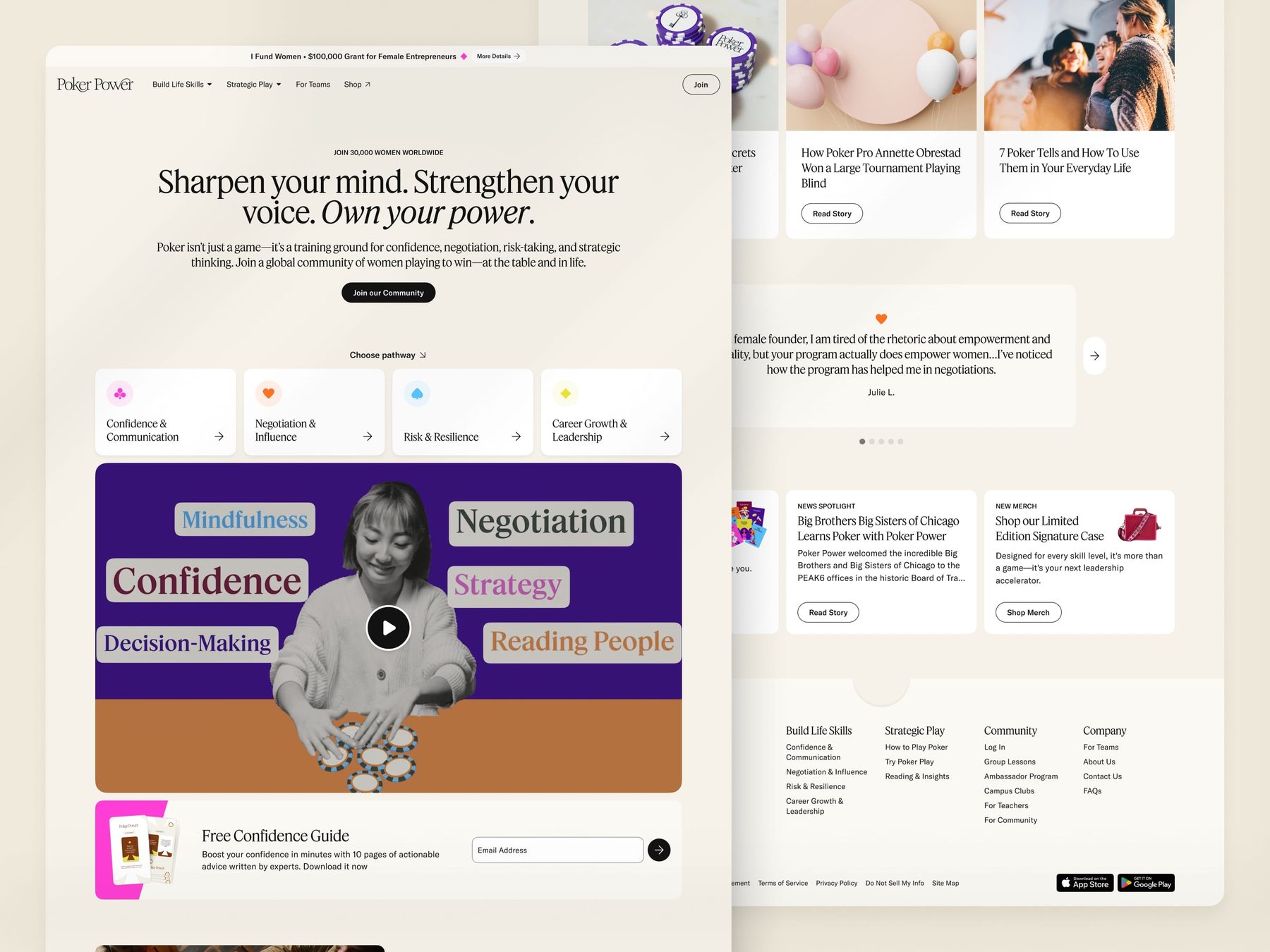
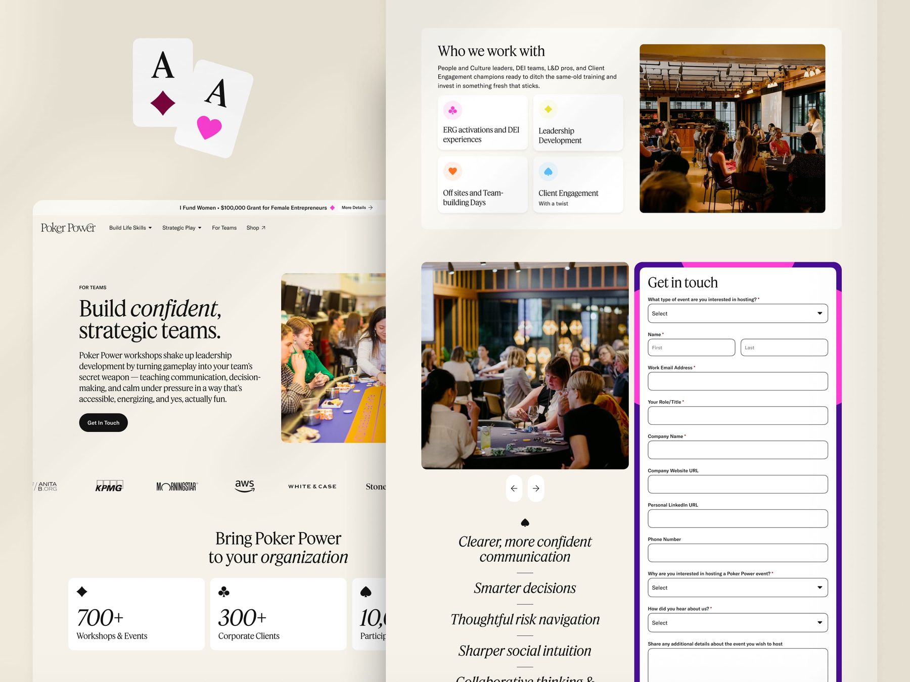
01 / 08
Next case study
MasterClassGrowth experiments across a premium membership funnel.