 Alex Camp
MasterClass · Growth
Conversion upat every step.
I designed and tested changes on MasterClass's core acquisition surfaces, from the homepage hero to checkout. Five of the six I tested lifted membership conversion in A/B tests.
- RoleSenior Product Designer
- Timeframe2022 – 2023
- TeamsGrowth, Consumer, Innovation
- SurfacesWeb, iOS, Android
The complexity
Curious visitors,
premium price.
MasterClass sells a premium membership. Visitors arrive curious but uncommitted, and every page between the homepage and checkout loses some of them.
At that scale, a few points of conversion are worth millions in membership revenue.
- VisitorsCurious, but not yet sold on a premium membership.
- GrowthFast A/B tests, from single sections to whole pages.
- BrandA premium look and a shared design system to stay true to.
How I untangled it
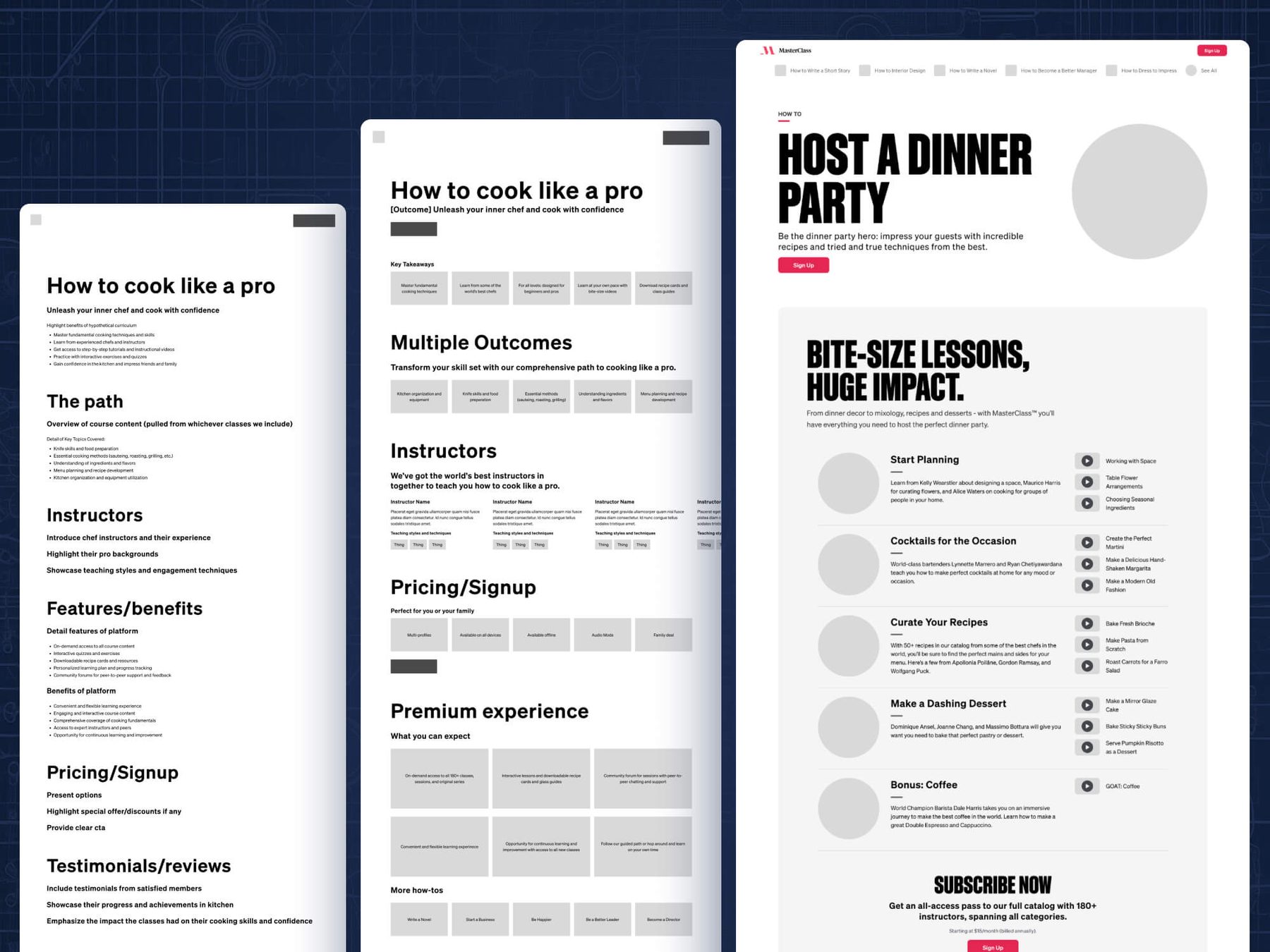
Instead of designing each test in isolation, I designed whole surfaces first, then tested against that plan: sometimes one section, sometimes the full page. Tests stayed fast, the pages stayed coherent, and the full designs became a ready backlog of what to test next.
Key decisions
Why these changes.
-
01
Start the convo in the hero
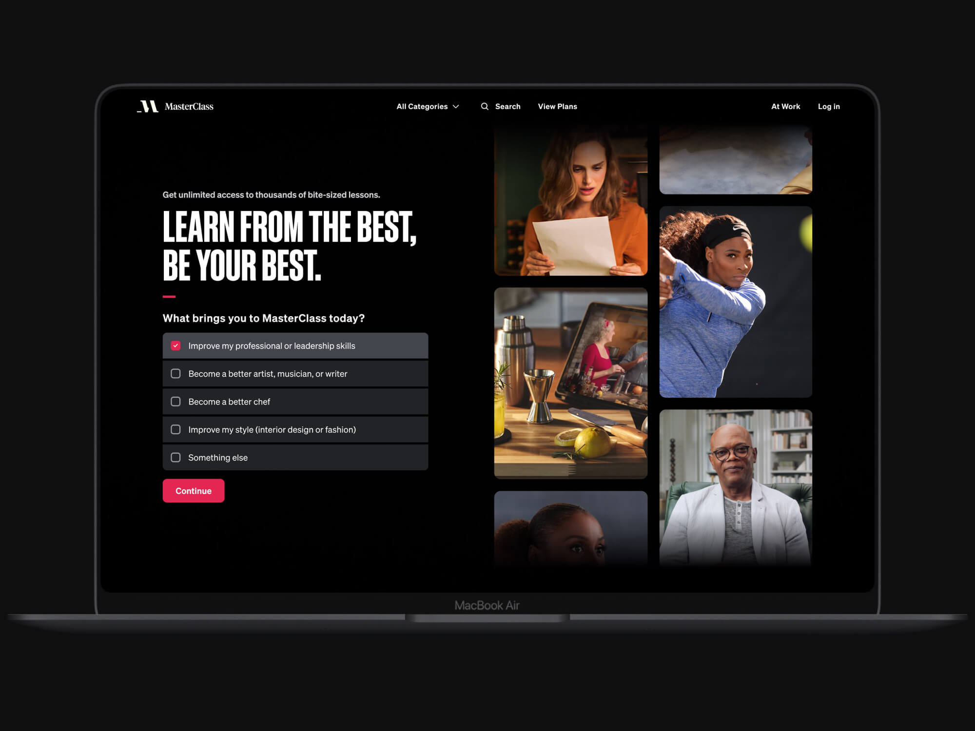
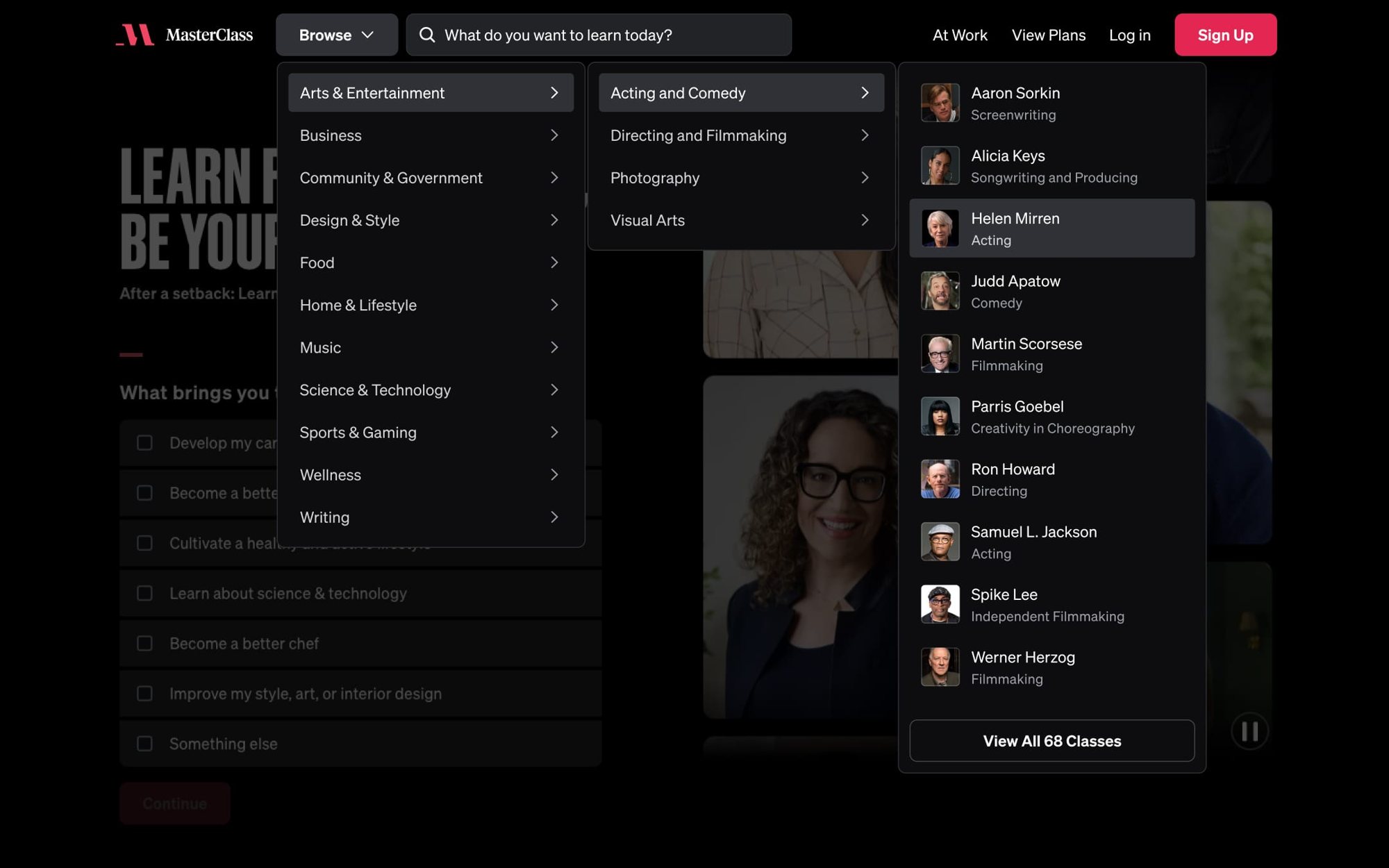
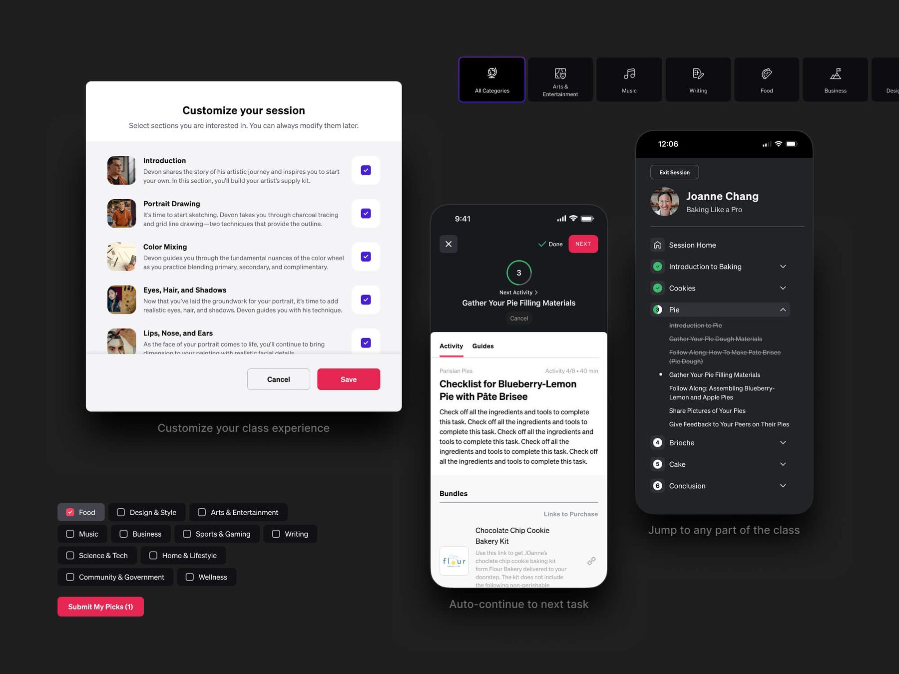
We pulled one onboarding question into the homepage hero, so the first thing visitors do is tell us what they want to learn.
-
02
Let users order the page
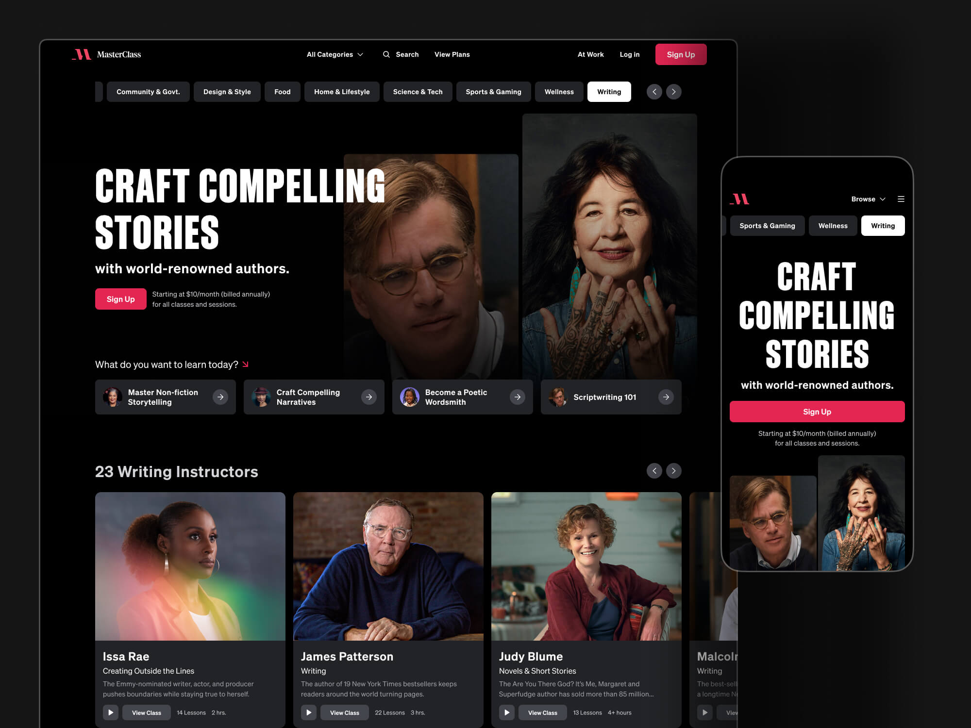
On category pages, users stack-ranked sections in low-fidelity prototypes. We moved what resonated most to the top.
-
03
Keep testing checkout
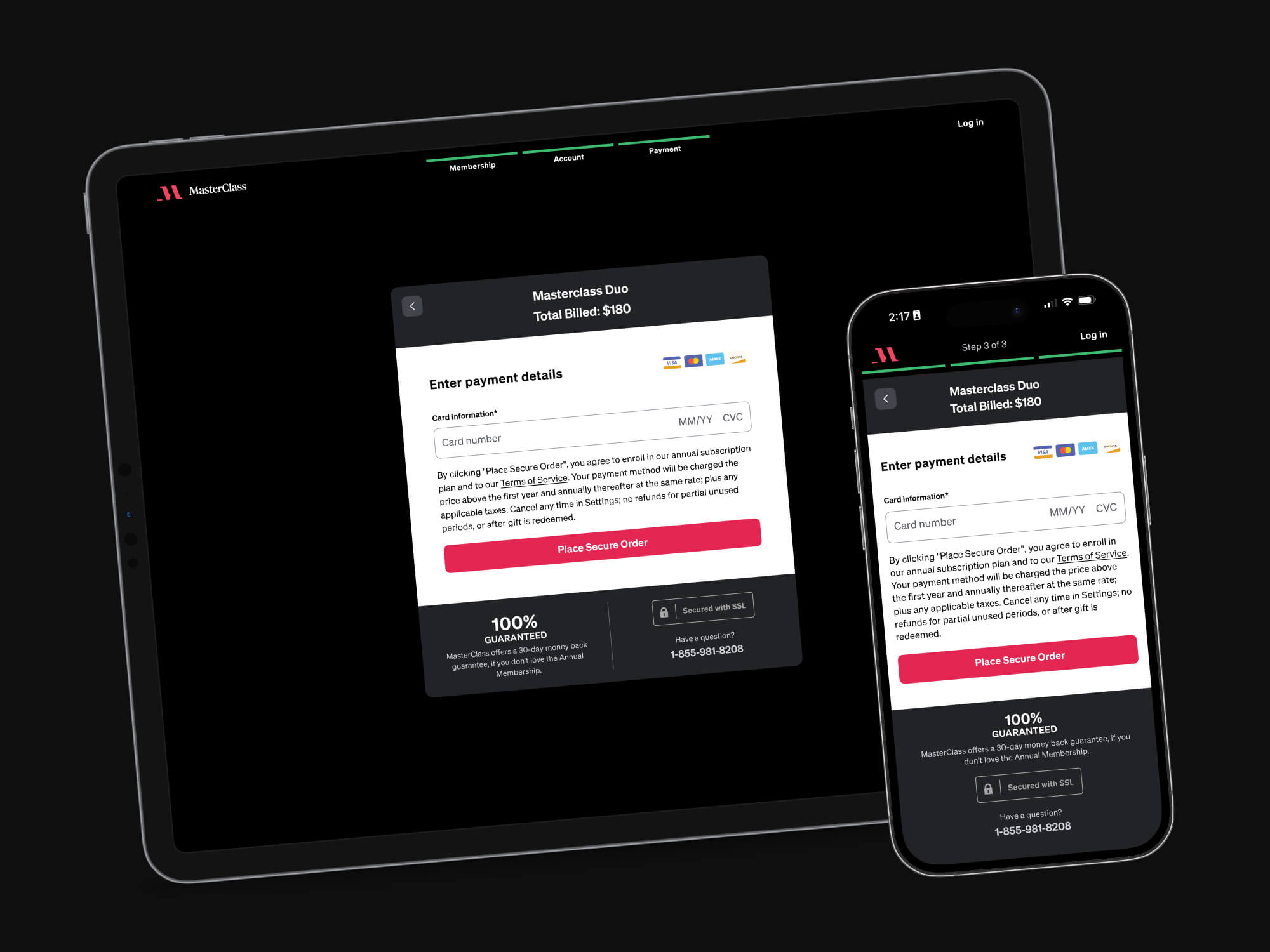
The first checkout tests lost. We studied why, iterated over several rounds and found a winner that also raised lifetime value.
The tradeoff
What goes in the hero?
Why
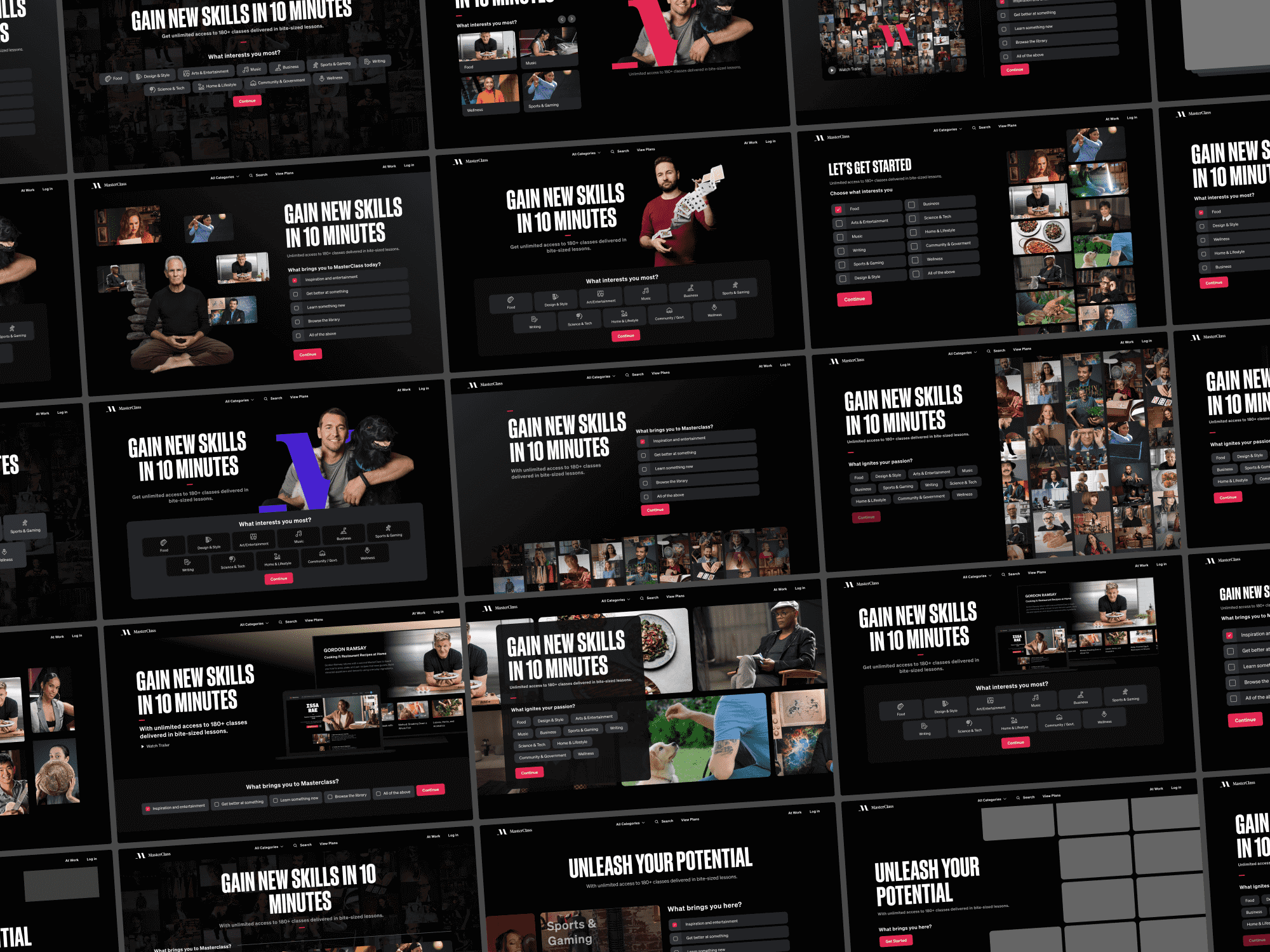
Our quiz flow was already one of our strongest converters, so instead of another generic call to action, I wanted to remove the friction of getting into it. Questions about a person and their interests are easy to answer, so I designed two framings to build conviction: motivational (pick your favorite interests) and aspirational (pick where you want to be).
It lifted homepage conversion 5%, and led to further tests of subcategory questions that added up to 11 more onboarding screens. They showed that more personalization meant more conversion.
Also shipped
The work, up close.
Impact
What moved.
- +5%Homepage
- +10%Navigation
- +10%Category page
- +7%Class page
- +12%Checkout
Membership conversion lift from A/B tests on each surface. Lifts are per test and aren't additive; the biggest were each worth millions a year in sales. A sixth test, on the quiz results page, came back flat. MasterClass won a 2023 Webby Award for education websites while I was on the team.
More from the project (07)
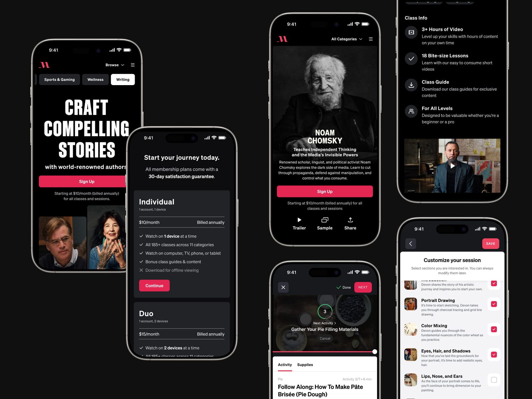
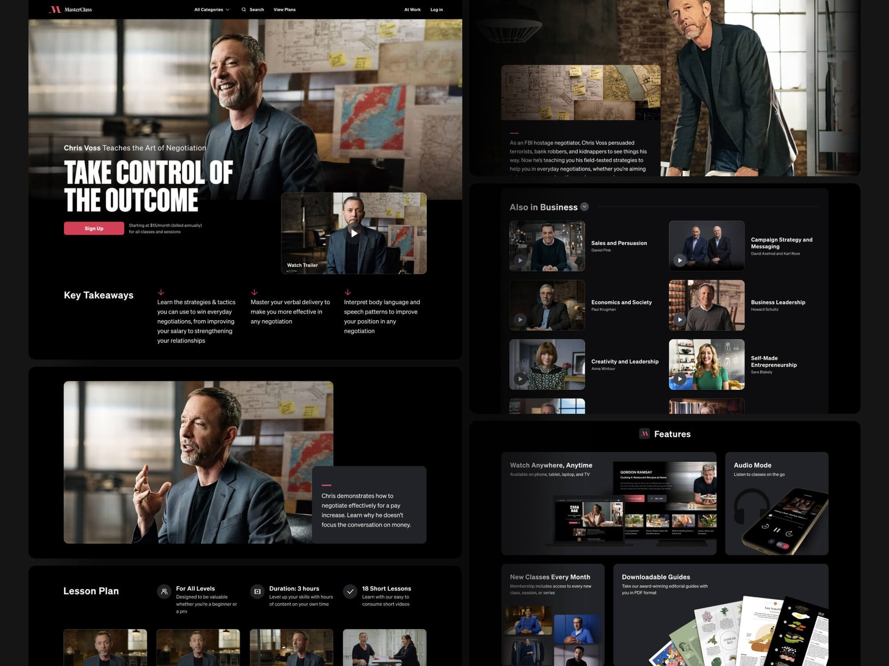
A few more screens.
01 / 07
Next case study
CohnReznickMy newest work: enterprise AI for accounting.